
Page 194 - Friedman Archives
P. 194
194 The “Recording” (Camera icon) Menu Settings
5.24.1 FREQUENTLY ASKED QUESTIONS
Q: “Are all these choices really
necessary? Which ones do you use?”
A: Some people love the fact that you
can do all these neat things in your
camera without ever having to visit
your computer later on. I will say
that, when combined with other
settings (keep reading!), you really
can tailor a kind of emotional feel to
your subjects using these
combinations of settings.
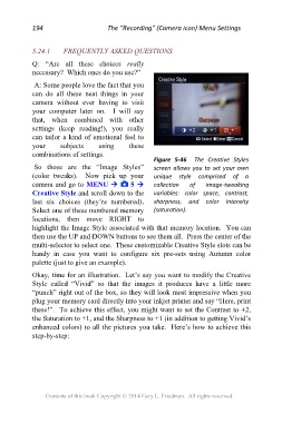
Figure 5-46 The Creative Styles
So those are the “Image Styles” screen allows you to set your own
(color tweaks). Now pick up your unique style comprised of a
camera and go to MENU 5 collection of image-tweaking
Creative Style and scroll down to the variables: color space, contrast,
last six choices (they’re numbered). sharpness, and color intensity
Select one of these numbered memory (saturation).
locations, then move RIGHT to
highlight the Image Style associated with that memory location. You can
then use the UP and DOWN buttons to see them all. Press the center of the
multi-selector to select one. These customizable Creative Style slots can be
handy in case you want to configure six pre-sets using Autumn color
palette (just to give an example).
Okay, time for an illustration. Let’s say you want to modify the Creative
Style called “Vivid” so that the images it produces have a little more
“punch” right out of the box, so they will look most impressive when you
plug your memory card directly into your inkjet printer and say “Here, print
these!”. To achieve this effect, you might want to set the Contrast to +2,
the Saturation to +1, and the Sharpness to +1 (in addition to getting Vivid’s
enhanced colors) to all the pictures you take. Here’s how to achieve this
step-by-step:
Contents of this book Copyright © 2014 Gary L. Friedman. All rights reserved.